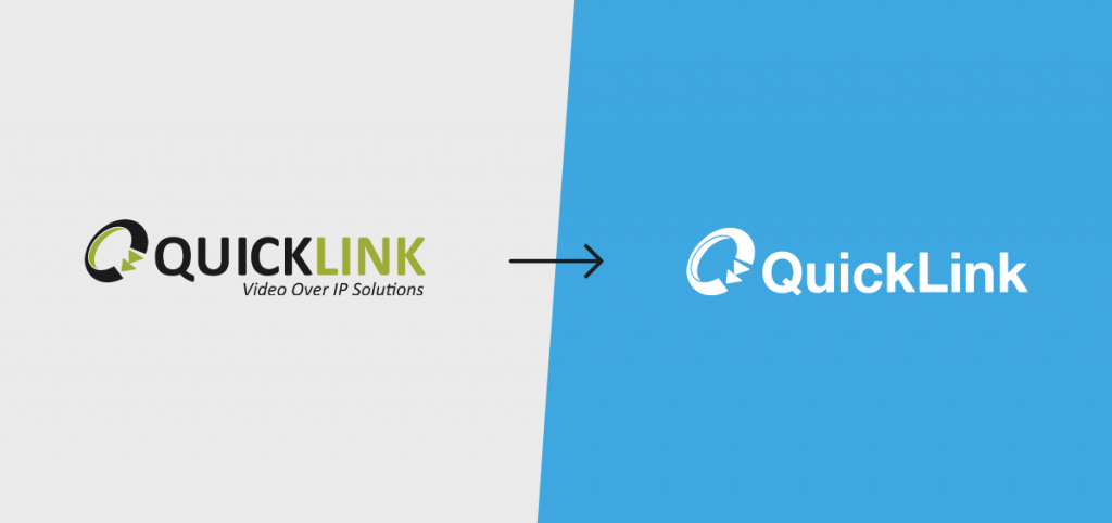
QuickLink unveils new visual identity
April 8, 2024

QuickLink, a provider of remote production solutions for broadcasters, production companies, sports organisations, and corporates, has unveiled a new visual identity and consolidation of its product lineup. The company says this announcement reinforces the company’s evolution and positions it for continued growth, particularly in the North American market.
The refreshed QuickLink brand features a streamlined logo blending the iconic circular ‘Q’ symbol with a new custom-designed wordmark, all rendered in both uppercase and a newer lowercase style. Quicklink said the blue colour palette was chosen to “evoke qualities of inspiration, serenity, and trustworthiness that align with QuickLink’s core values of listening to customers, focus, and a human-centric approach”.
“We are very excited to announce our new branding. Having seen exponential growth over a number of years, we wanted a logo that both embodies innovation and our core values, yet making sure we are still recognised for being the QuickLink that everyone knows,” said Richard Rees, CEO of QuickLink. “The ‘Q’ symbol has been with us since our foundation in 2003 and has become widely recognised across the industry, symbolising continued connection and innovation”
The rebrand coincides with QuickLink expanding into new vertical markets like the corporate sector. A key aspect of the rebrand is the consolidation of QuickLink’s entire product lineup into a unified ecosystem, resulting in many of QuickLink’s solutions receiving a new naming identity. The new naming of the QuickLink Studio ecosystem, simplifies existing products such as Cre8, ST55, ST250 to StudioPro, StudioCall, and QuickLink StudioRemote respectively.
“Not only did we want to update the logo and color palette, but we also felt like it was necessary to unify into a solution ecosystem that utilises the complete production power of QuickLink Studio Solution,” said Rees.
